|
|
|
|
|
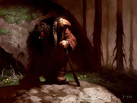
Artist Theory: Lost Edges
This piece started out as homage to the early 20th century Swedish artist, John Bauer, and his unique take on Scandinavian mythology. Back in his day, artists didn’t have to suffer the fangs and horns syndrome that is so prevalent today in commercial illustration. With his trolls, Bauer was more interested in expression and soul than trussing them out in heavyweight spiky armour oversized weapons. And that is why they remain such powerful and moving images, even 100 years later. I wanted to stay faithful to Bauer’s original design, while giving it my own treatment. I began by making a detailed pencil drawing of the character, then proceeded with a brown ochre background. At this point, the most important thing is to make the image easy to read. Your eyes should move freely and not get stuck at jarring or confusing details. The sketch should never get in the way of painting; these are two very different things and should be approached accordingly. The light dictates that much of the figure would be hidden in shadow, so a lot of detail from the original sketch gets lost in this process. An effective way to make a painting easy to read is to try to find ways to connect the shadow volumes. Look at the left leg of the troll and how its shape merges with the cave opening in the background. We can still make out the leg even though the only things defining its shape are the tip of the shoe and a blob of green. When features are merely hinted at the brain fills in the blanks, so it doesn’t take much for the eye to make sense of seemingly random shapes. The better part of the face in this piece is hidden in shadow. Once again the shadow areas merge with the background without the slightest hint of outline. The edge is completely lost, but we still feel a face in there. We can even imagine an expression on the troll, and perhaps because his features are so obscure he takes on life through our imagination. People often express discomfort at the prospect of simplifying a painting to the point where detailed and interesting areas need to be left out. Far too often is means the details come first at the expense of the composition. Unfortunately, this results in dense, sprawling paintings without a sense of direction and we can’t see the forest for the trees. There’s a lot to be gained from connecting shadow areas and consciously directing the viewers’ attention with the use of lost edges. |
|
|